I have continued my series inside grocery stores. You can imagine how redundant it can get photographing products on shelves. Capturing shapes and random gaps in the product lineup was my first attraction.
This time I went in with color as my mandate. I went to find combinations of colors, and relationships of colors. There are three parts of a color. The hue, which is the color, like green or red. The saturation, which speaks to the clarity of the color or the purity of hue. Meaning there is no contamination of the color by black, white or gray. The third component of color is the tone. Tone could be thought of as the amount of white or black in a color, but is really the lightness or darkness of the color itself.

I have been learning recently about color and photography. You might think with my years of experience I would know all about color photography. Well, I can tell you there is always more to learn.
For instance, analogous colors, are those that are closely related like yellow, orange and red.
Photographers speak of subtractive and additive colors. These are red, green and blue as additive colors because if you add them together in equal amounts of light you end up with white. The subtractive colors are yellow, magenta and cyan. If added together in equal amounts you get black or dark gray. CMYK is the lithographic set of colors for reproduction. C is cyan, M, magenta, Y for yellow and K is black. The printers need to add a plate of K or black for contrast.

I don't want to get too caught up in the science of this but I did want you to know there is reason and esthetics behind color and the way and how we see them in relationship to the narrative or depictive level of a photograph. Whew, that sounds complicated and frankly it is complicated but understanding it a little compounds the enjoyment of the experience.

Enjoy the experience.


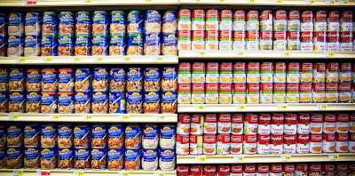
 Now this is a case of beer.
 Need to replenish your salts and hydration?
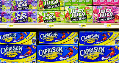
 Variety is the spice of life.
 Got Milk?
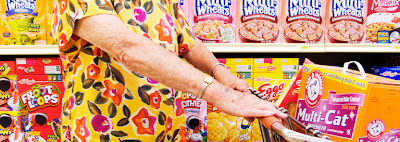
 And cookies!
 My favorite.